
This is a guest post from my favorite online resource, One King's Lane.
Thank you as always OKL!
_____________________________________
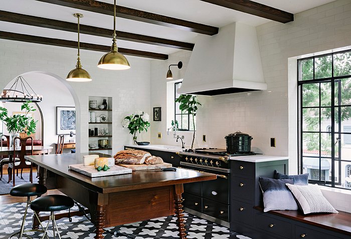
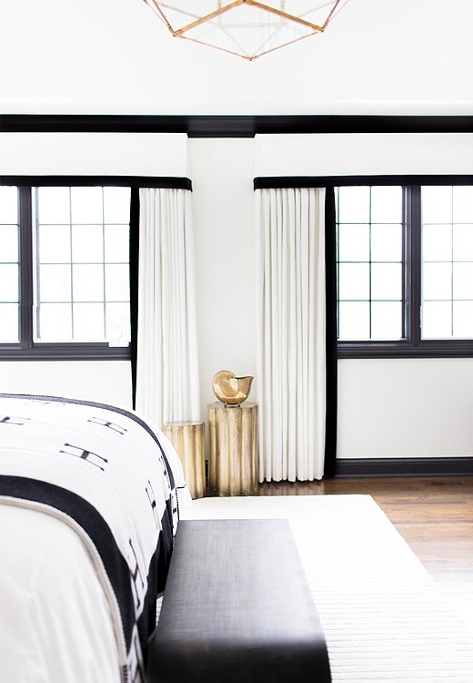
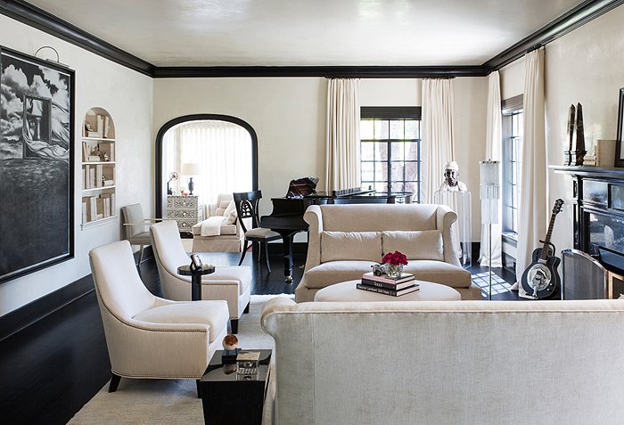
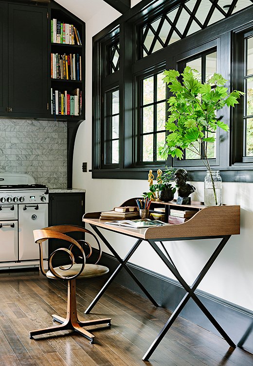
The Hot New Trim Trend We’re Loving
Black-painted trim and molding is a refreshing shift from white—and beautifully highlights a room’s best features. Here’s how to use it.
________________________________
10 Design Lessons from Ashley Hicks’s Instagram Feed

A few things become clear when you follow@ashleyhicks1970 (the handle of English designer Ashley Hicks) on Instagram:
He’s as bold and ingenious as his father, famed designer David Hicks.
He has a great sense of humor.
He has an incredible eye for everything (from chickens to tapestries).
We took a quick look at the world through his lens and found some fantastic design ideas to put to use in any space.
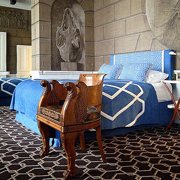
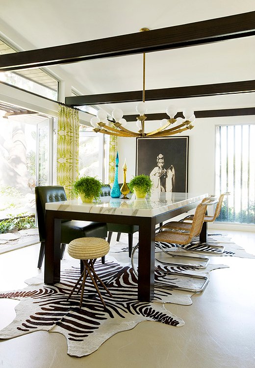
Lesson #1: Good Antiques Go with Anything
Don’t get hung up thinking that because of its distinctive period details, an antique needs to be surrounded with similar pieces. This ornate chair shines among modern, geometric patterns.
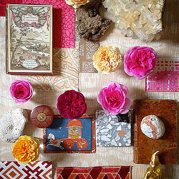
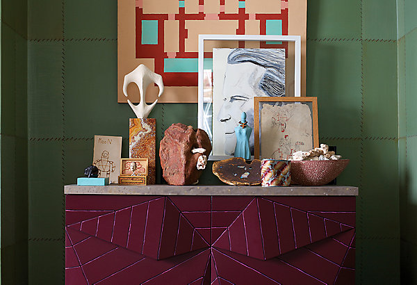
Lesson #2: Coffee Tables Are Canvases
Hicks inspires us to think beyond a tray and a vase. His harmonious palette, mixed patterns, and loads of natural beauty create a striking surface.

Lesson #3: Opposites Do Attract
You might expect sleeker hardware on minimal cabinets, but expected just isn’t Hicks’s style. White coral pulls are surprising and sculptural, with just the right amount of quirk.
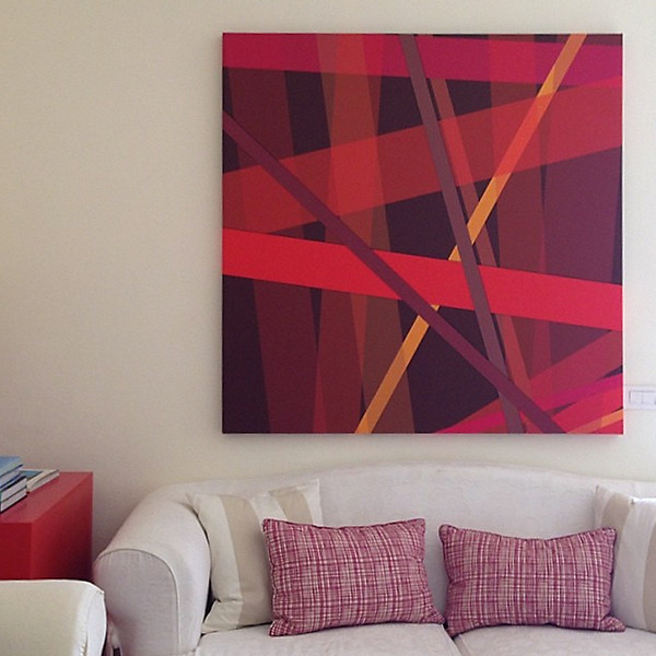
Lesson #4: Look at Art As Pattern
The word pattern brings to mind textiles, but Hicks proves that’s not your only option. Maybe that sofa doesn’t need a bold fabric but instead a bold print just above it. We love how the pillows subtly echo the artwork’s graphic lines.
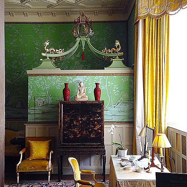
Lesson #5: Chinoiserie Is Better in Numbers
Most would stop at the wallpaper, or the cabinet, or the vases. But when the motif is spot on, the more the merrier.
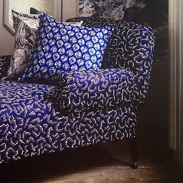
Lesson #6: Print Mixing Favors the Bold
Hicks’s own Munnu and Eleuthera prints are gutsy on their own, but together they create an even more striking mix. As long as hues don’t fight each other (you’ll know it when you see it), don’t be afraid to try out bold combinations.
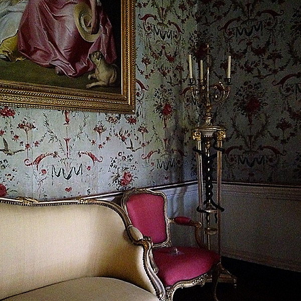
Lesson #7: Hot Pink Can Be Elegant
Bright hues don’t have to scream in a space. When you pick a classic silhouette, even bold fabrics speak more genteelly.
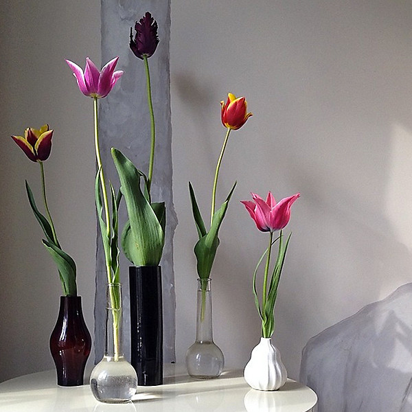
Lesson #8: Elevate the Everyday
These tulips would be stunning even in a coffee can, but clustered in bud vases of various shapes and sizes they create a modern still life.
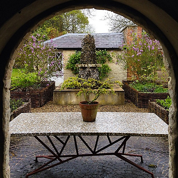
Lesson #9: Outdoor Furniture Counts Too
The unique lines of Hicks’s garden table are as refined as those of any piece in a formal indoor room. The upshot: It needs little adornment.
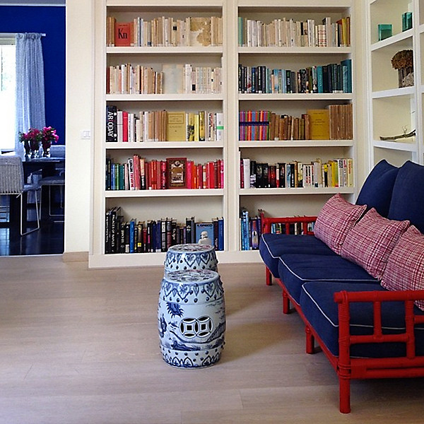
Lesson #10: Never Underestimate a Coat of Paint
A quick coat of red paint on a bamboo sofa (which belongs to one of his clients) updated the classic piece and made its details more striking.
Shop Ashley Hicks’s Vintage Picks
And finally, in my favorite news today, OKL is doing custom upholstery now. And some of them are what you'd pay at Target - Seriously, $359 for a custom bench, etc. See below:


Fabulous tips Stacy! I love Ashley's design ideas and the black accented rooms, ahhh!
xoxo
Karena
The Arts by Karena
Love all of Ashley's tips - a coat of paint can truly work magic. And yes black painted trim is a prime example…adore black painted doors!
I find these are the greatest tips I have read in a while...love the black trimmed decor...just so classically elegant!
That black!!! LOVE IT!! franki
Post a Comment