Some of us (probably every decorator ever) have been styling our tables without thinking much about it since our very first apartments. Our even before that, while living with our parents. (Ahem.) But to others, it doesn't come naturally.
As Lynne wrote:
As Lynne wrote:
The one thing that I have the most trouble with is styling my coffee table! It's either too busy or too plain, too big or too small. Can you please help me figure out a good rule of thumb for decorating a rectangular coffee table?
I think this is a great question. I love it because it forced me to think about something that I don't really think about, and to come up with some "rules." Here's what I think:
1. First, if you are not comfortable winging it, copy! Why reinvent the wheel? Find one you like, and chances are you can copy it with your own books and trays and things from Home Goods. That's what the photos below are for.
2. Live plants and flowers are almost a must. For every great coffee table vignette, there is at least one live item.
3. Like realtors say "location location location" about homes, I say "repetition repetition repetition" about vignettes.
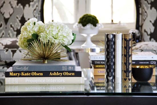
Here's what I mean. Although this is a more complicated or intricate vignette than some, it is a good example of repetition, in the black in 4 places and the gold in four places. also, there is repetition in the books - three different sets:

And this one - notice the repetition (or using the same object more than once) in the ginger jars and candles:
And here. Two sets of books of like colors, two objects on top, both made of glass:
4. Follow the Rule of threes. (The above examples do this, too). In the photo below, the rule of threes comes in with the 3 different objects (vase, votives, and candle sticks), and again with the votives (3 of them). Also make sure you pull in some colors from your room, like they did with the lavender here:
Here are some more examples of these principles:
Match something in your vignette to a color in your room, like this. It doesn't have to be this bold or obvious, though:
Rule of threes - three sets/stacks of objects:
Sometimes things don't match at all but still look great:
Threes - three sets of objects (books, box, glass pieces), repeated int he three glass pieces:
^
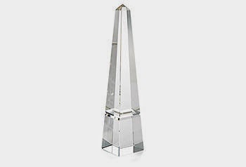
These crystal obelisks are available here

See the rule of threes in play below?
A basic and easy way to start - books, flowers, and a box:
Another good example of repetition:
On a big surface, sometimes you need more than 3, but again, keep like objects together and repeat colors:
For larger and more complicated vignettes, trays are a great way to start. Consider the objects in the tray the part 1 of your 3 - so the whole tray, candles, and ginger jar are 1, the yellow flowers are 2, and the boxes are 3:
For those of you who want an easy formula to start, try this, like in the first photo of this collage: 1. Pile some book (optionally add flowers or coral or something similar on top), 2. Add a tall object (candle or vase or orchid) to the side, and 3. Add a box or statue or other low object to the other side:
I really hope that helped! And please keep the questions coming :)
______________________________________________________________
______________________________________________________________
______________________________________________________________
See What's New in Today's Daily Deals:
Follow My Most Popular Pinterest Boards:

a
Subscribe by Email:
Subscribe by Email:


This is fantastic! Thanks for that, think I need to go and do some tweaking ala Stacy!
I do believe vignettes are my "favorite" past time!! Isn't it FUN to come up with these scenarios?!?!? Course, I really luv the glass orb and crystal objets d' art! franki
Stacy I love to see how others style their tables!
xoxo
Karena
The Arts by Karena
More ROUND table tableaus please!!!
Love vignettes! Thanks for the pics and notes. I'm marking this one for reference.
Stacy...a great collection of inspirations! I find that this
can be very difficult for a lot of people to do...I'm going to have to pin a few of these beauties...
Truly said, interior designing has now a days lot of scope not only in designing for house or office but the requirement of interior designer is required in each and every sector of industry.
Modern Living Table
Post a Comment